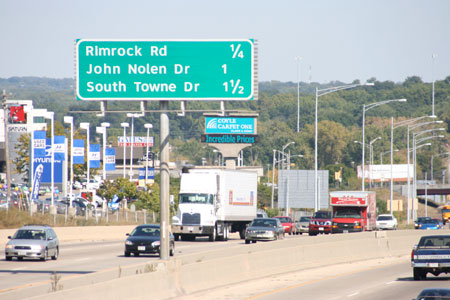
Perhaps this is a sign that I need a more interesting life, but I was thrilled to see some of the highway signage in and around Madison, WI, start to change over to Clearview, a typeface designed specifically for road signs.
Nearly everyone who’s driven a car knows the limitations of the current standard for road signs, FHWA Series fonts (it is affectionately called “Highway Gothic” by typophiles). At night, the letters seem to blur together and glow, and some characters are difficult to distinguish from others.
Clearview is the result of nearly a decade of work, making a typeface that is more readable without increasing the dimensions of the existing road signs.
You can read about Clearview on the official website, and of particular interest is the Research section.
Sam Jackson
Latest posts by Sam Jackson (see all)
- Careers in Science: Kris Pearson, Custom/OEM Production Manager - July 18, 2016
- Ghosts - March 24, 2014
- Slightly More than Half of Everything I Am Is Thanks to You - May 6, 2011

Hi
Thanks for this article. I knew something was different about some of the signs on the Beltline and have been at elevated risk of an accident while trying to figure it out! I like the new font.
Regards,
Pat