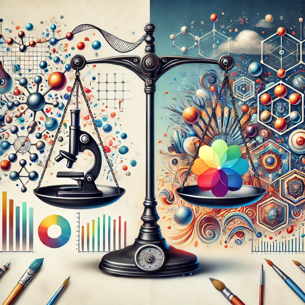
In the ever-changing landscape of life sciences, the relationship between science and design remains essential. For example, have you ever read a blog or article overloaded with excessive terminology? Or an advertisement with complex information or graphics? This can be overwhelming and may cause you to miss the key message. Similarly, when an image is overly designed, it risks missing the mark entirely.
Enter the scientific figures. Whether the data is conveyed through complex graphs or scientific illustrations, design plays a vital role in providing clarity to the story. With that in mind, here are a few tips I’ve learned as a designer working with scientists in the life science and healthcare fields that can help you collaborate more effectively:
Start with the “Why”: The Key to Better Design
Start with a project kickoff meeting that includes all relevant people. This provides the foundation for a shared understanding of the purpose and primary audience of a creative piece. This information is crucial for the designer to create an informed first draft.
Ask questions such as:
- “Why are specific data points important?”
- “How do they contribute to the story being conveyed?”
Communicate Frequently
Schedule regular progress reviews to allow for iterative feedback. These sessions provide opportunities to address areas for refinement and ensure alignment. Utilize collaboration tools such as Miro, Adobe XD, or Figma for real-time feedback, ensuring seamless simultaneous collaboration, even in remote settings. Early and frequent communication helps avoid misunderstandings and wasted effort on both sides.
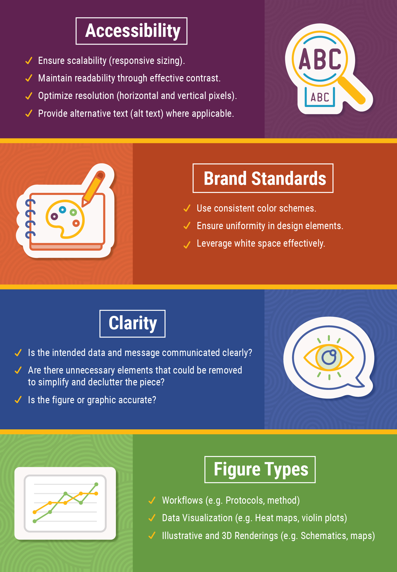
Nail Your Design Style Every Time
A consistent style across all figures and graphics strengthens their impact. Below are essential design principles for you to keep in mind for scientific figures:
Less Is Often More
Sometimes, less is more. An absence of unnecessary information can provide the most clarity. Simplifying and decluttering figures enhances both their aesthetic appeal and their effectiveness. Below is an example of a biologics figure I’ve designed while applying these principles.

Let’s Talk AI
As design tools and processes evolve, artificial intelligence (AI) presents significant opportunities to revolutionize figure creation. AI can:
- Automate data visualization.
- Perform image analysis and suggest annotations.
- Optimize design processes for improved efficiency.
As science integrates with new AI tools, it’s important to remain cognizant of how to keep figures accessible to our audience. While AI can bridge gaps between complex data and clear communication, AI also introduces challenges. Because AI relies on data and algorithms, verifying their quality and integrity is essential to avoid inaccuracies, misrepresentation, or copyright issues.
We’re Better Together
Recognize the contributions of both scientists and designers to celebrate collaborative achievements. Sharing key learnings from the process fosters continued improvement in future projects.
Combining the analytical expertise of scientists with the creative skills of graphic designers can help you communicate complex ideas effectively in a way that captivates and engages the audience.
Remember, figures are designed to convey a clear and organized message, sans distractions. Embrace the principle that less is more—and always make white space your friend.
Want to learn more about Taylor McAda’s career as an artist? Check out this blog post.
References
- Zabala, A. (n.d.). Designing more effective scientific figures (II). Cancer Research UK. Retrieved from https://bioinformatics-core-shared-training.github.io/effective-figure-design/DesigningEffectiveScientificFigures_Zabala_afternoon_v00.pdf.
- Rougier, N. P., Droettboom, M., & Bourne, P. E. (2014). Ten simple rules for better figures. PLoS Computational Biology, 10(9), e1003833. https://doi.org/10.1371/journal.pcbi.1003833
- The Artful Scientist. (2019, June 11). A picture is worth a thousand words: The art of scientific figures. Retrieved from https://artfulscientist.home.blog/2019/06/11/a-picture-is-worth-a-thousand-words-the-art-of-scientific-figures/
Taylor McAda
Latest posts by Taylor McAda (see all)
- Figure Methodology: The Balance Between Accuracy and Aesthetics - February 13, 2025